New mobile viewport units supported natively
CSS viewport units svh, lvh, dvh, svw, lvw, and dvw for improving mobile design now in Flipsite out of the box.

CSS viewport units svh, lvh, dvh, svw, lvw, and dvw for improving mobile design now in Flipsite out of the box.

Creating websites that work on all devices requires that you stick to standards. Not only standard CSS with mediaquery breakpoints, such as flipsite does, but also that you follow the same methodology all throughout and resist the urge to grab a ready made javascript that does something and breaks all hell loose.
But building for mobile device height has been a bit of a pickle, due to mobile browsers height varying during scrolling thanks to e.g. the address bar disappearing and appearing or the keyboard popping up and taking a significant amount of the screen. A convenience feature and a must from the users perspective – but an extra thing to keep in mind for us website developers that strive for perfection.
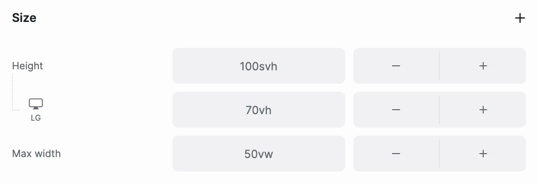
Weve now included these new viewport units svh, lvh, dvh, svw, lvw, and dvw in all places you can use height, size etc.
Although all sections in flipsite are built for the 6 standard viewport sizes we support and its easy to add variations to your design (such as below), having support for only percentage and pixels wasn't enough.

Think of a mobile devices viewport with and without scrollbars & addressbars & keyboards and its easy to understand what these new supported viewport units mean:
At the end of the day these affect the CSS created by flipsite. You dont have to worry about the CSS itself – as with everything else in flipsite, you create the site and flipsites compiler makes sure consistently lightweight and correct HTLM & CSS is created so that its accessible and fast for all devices and humans.
This call to action text is generated by AI – because when you run out of ideas on what to do, Flipsite's AI engine will help you drive conversion!
Create account©2025 Flipsite. All rights reserved.