Why Websites Haven't Changed in 20 Years, But Should
Websites are still about information, but today hidden behind large menus and cluttered design

Websites are still about information, but today hidden behind large menus and cluttered design

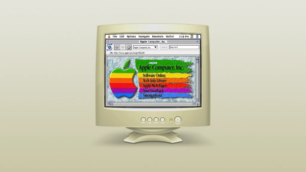
For two decades, websites have been the digital frontier for information. However, despite the rapid evolution of technology, the core essence of websites remains surprisingly stagnant. Lets dive into a time capsule and explore why websites seem frozen in time, with their crucial information and calls to action often buried beneath layers of slow-loading images, mega menus, and flashy designs that capture our scroll events and do the opposite of their intention.
Two decades ago, websites were designed to deliver information and facilitate user actions. The internet was an academic project for sharing information. Fast forward to today, and the primary purpose remains unchanged. However, what has evolved is the way this information and action-taking potential is presented; more clutter, more popups, more ads. Today's websites are like used car-sales men, being anything but helpful.
In the quest for visual appeal, many websites have fallen victim to large, slow-loading images that prioritize aesthetics over functionality. This not only affects user experience but also contributes to longer page loading times.
Mega menus, once hailed as the solution to navigation challenges, have become intricate puzzles for users. Navigating through a labyrinth of options can be a frustrating experience, deterring users from finding the information they seek. Small and midmarket company websites have become megacorp intranets – places were soul go to die.
Cluttered pop-ups, particularly those related to GDPR and cookies, have become a necessary evil. While compliance is crucial, the barrage of pop-ups impedes the seamless flow of information and actions, leaving users caught in a web of consent.
Modern web design often prioritizes flashy aesthetics, sometimes at the expense of readability. We already killed Macromedia Flash, why are we trying to bring it back? The result? Users struggle to consume the content they came for, leading to higher bounce rates and missed opportunities for engagement.
Despite designers working on state-of-the-art iMacs with lightning-fast internet, the reality for users is often different. Mobile usage is on the rise, and internet speeds can be sluggish, especially in certain regions. Its time for websites to bridge the gap between design aspirations and real-world accessibility.
Consider this: the average mobile website takes more than 15 seconds to load, while 53% of users abandon a site that takes longer than three seconds to load. These statistics underscore the urgency for a user-centric approach that prioritizes speed and efficiency.
Amidst this era of change, some websites stand as monuments to tradition. Take, for example, Berkshire Hathaways website (https://www.berkshirehathaway.com/), a relic of simplicity in a world of complexity. Its unassuming design is a testament to the enduring power of straightforward information delivery. While few companies could survive with Berkshires design – there's something in the simplicity that talks masses.
As we unravel the paradox of stagnant websites in the digital landscape, the call for change becomes apparent. Its time to break free from the shackles of slow-loading images, confusing navigation, and flashy designs. Embrace a user-centric approach that respects the users time and internet constraints. In doing so, your website can become a beacon of efficiency and user satisfaction in a sea of digital noise.
Flipsite is a website builder that doesn't let you build slow or un accessible sites. All websites built with flipsite out of the box score 100/100 on all lighthouse test. The technology we've built has been battle tested internally since 2020 – but today were releasing it to the world.
We welcome feedback and ideas. Lets build a better internet together! Try it out for free today!
This call to action text is generated by AI – because when you run out of ideas on what to do, Flipsite's AI engine will help you drive conversion!
Create account©2025 Flipsite. All rights reserved.