Canvas based designer
More than a HTML editor, more powerful than a blank canvas. Design, animate, bind CMS content, share, and publish.
Read more about the editor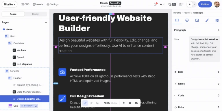
The website builder for professionals. Create sites that score 100% on SEO, speed, and accessibility. Built in EU, deploy anywhere.
Create a Free accountA website builder that walks 100% of the walk on web vitals tests.
flipsite.io
wordpress.com
framer.com
webflow.com
webnode.com
squarespace.com
wix.com
Real life results of testing the mobile frontpage of every vendor with Google PageSpeed June 4th 2025.
Detailed comparisonMore than a HTML editor, more powerful than a blank canvas. Design, animate, bind CMS content, share, and publish.
Read more about the editor
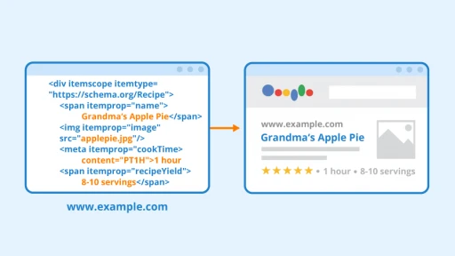
Create and manage your content in CMS collections. Localize to any language. Use AI to help create content. Bind to components in the editor. No limitations on collections or CMS items.
See all features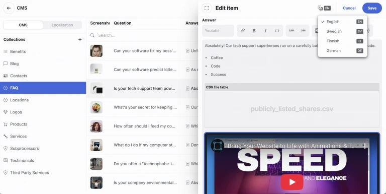
All flipsite built websites are optimized for technical SEO, accessibility and speed. Score 100% on all tests out of the box.
Pages built with flipsite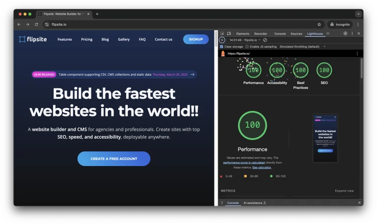
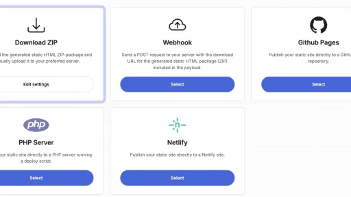
Enjoy full freedom with Cloudflare Pages, GitHub Pages, AWS, Netlify or FTP to your local server.
Read more on deploymentThis call to action text is generated by AI – because when you run out of ideas on what to do, Flipsite's AI engine will help you drive conversion!
Create account©2025 Flipsite. All rights reserved.